Below are my initial sketches and designs for the publication. I have tried to add multiple ideas to the designs in order to fully explore my concept and showcase it to its potential.
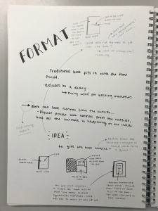


These were quick sketches in order for me to get a sense of how many pages I would be looking at creating and how the structure of the document would work. I also wanted to get a sense of how the type could be played with within the document, looking at pace in particular in order to try and convey how the different emotions would be highlighted. The initial sketches showed that I was looking at creating around 80 pages / 40 spreads, which I initially didn’t expect.
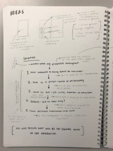
The idea behind the structure of the book is to have some form of order and a pattern almost, asking questions to try and find out who he was – before the illness really took a turn for the worse. This is where the bulk of the text sits, with myself interjecting at various moments. There is then a turning point halfway in the book, whereby my great-grandfathers wife (so my great-grandmother) passes away. From this point the book deteriorates in order to highlight how my grew-grandfathers illness deteriorated. The order from the beginning is then lost and it is about really showcasing the different emotions felt when suffering with a disease such as Alzheimers.
I feel breaking the idea down really helped me to see how it could take shape because I feel the underlying concept is strong, but needs strong execution to allow it to sit at its fullest potential. Digitalising them will allow me to really see how the system works.
Choosing different typefaces…
From the offset I knew I wanted a traditional serif typeface for my family’s memories – but one with a large family in order to differentiate between the weights and to therefore differentiate between them. I also knew I wanted a more contemporary sans serif typeface for my voice because I feel a sans serif is much more current compared to a traditional sans serif, which would be appropriate for the time period my great-grandfather was alive. I am looking back into the past through the memories to find out who he was, therefore, the sans serif typeface is reflecting back at the serif typeface.

My initial thought for the serif typeface was Baskerville for its beautifully crafted letterforms that feels as though it has a long history attached to it. I then quickly realised that it only has a limited number of weights – not enough for me within this publication. I then thought of Garamond for its visual similarity with Baskerville. Garamond has a very large font family and has been interpreted by type designers over the years, therefore there may be some minor differences to the original. I thought this was perfect for my concept because through research, I discovered that memories, when recalled are manipulated slightly before being restored – and as the serif typeface is meant to voice my family’s memories – I felt the two work harmoniously together. I also think Garamond feel rooted in history and has a classical feel to it.
For the sans serif – I really struggled with this. I read up on sans serif typefaces that compliment Garamond and what came up was Helvetica Neue, Futura and Gill Sans. I however, didn’t feel that any of these worked particularly well as they didn’t feel personal or felt like I was talking. It didn’t feel like me in a nutshell. I tried out multiple typefaces until I came to Mr Eaves. I was unsure at first, but when I really studied the letterforms, I felt as though they were light on the page and had personality to them. I thought they had a feminine essence to them and I felt like the type was me talking. I also thought it works well with Garamond and they compliment each other.
I then realised I needed a third typeface as a middle ground – a narrator almost for certain elements when it wasn’t anyone talking. I quickly put Baskerville in there for the time being but already concluded it was too similar to Garamond and simply didn’t work. This will need some thought but is not something I am overly worried about at the moment.
Digitalising the designs…


I brought my sketches to life by digitalising them and showcasing how the type could work using a variety of different systems to highlight different issues faced when dealing with the condition. I also wanted to get a feel for how some of the heavier text pages would work compositionally. Seeing it come to life allows me to see areas of strength and areas that need improvement.
My main aim for this document was to get all the text properly organised and set out in order to build the foundations of the book. Having the foundations set allows me to build on top of it and refine it until it is a strong final outcome. At the moment, I feel I have got a strong narrative and the main shell and structure of the book is there. As for the treatment of the type I need to do a lot more work in some areas and I don’t feel I am being experimental enough and am not pushing the type to its fullest extent. I also worry I am trying to do too many things at once. I do feel some guidance is needed at this point to help me push it forward as I worry I have been looking at it for too long and am getting stuck in not knowing which direction to go in.
