ISTD: Final Outcome

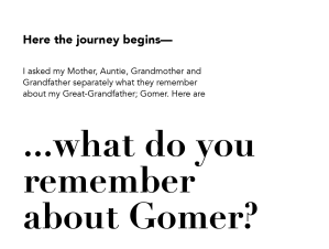
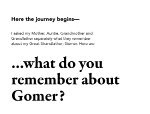
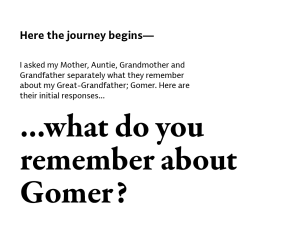
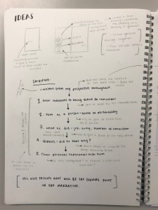
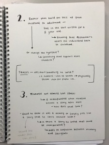
Having completed my final ISTD book, I have inserted images below showcasing the final piece. Before the images is a statement surrounding the context of the boom to give a clearer sense of what it is about…

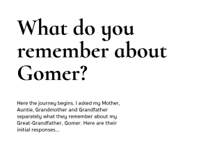
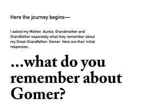
Gomer Lewis Latham is the name of both my Great-Grandfather and title of my publication. It is a book of discovery uncovering who Gomer was. I was never able to know him and have therefore set out to recover what is lost through personal discussions with my family…

Having only been two years old when Gomer passed away, I do not recall any memories of him. The structure of the narrative follows Gomer’s descent from a healthy and capable individual, to one suffering with Alzheimer’s; a disease that slowly engulfs the mind. Memories become lost, along with the ability to interact with the world. 

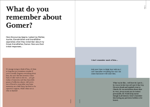
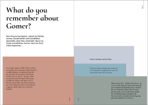
The content of the book focuses on four voices, my Mother (Elaine), Auntie (Christine), Grandmother (Mavis) and Grandfather (Denzil). Each voice recalls their own memories and experiences shared with Gomer. To differentiate each voice, each has been assigned a colour and a weight from the font family; Cormorant Infant. It was important to select a font family as it is my family who are central to the narrative. The decision to use a serif typeface was for the traditional and historical connotations that are associated with serif typefaces. Additionally, I have my own voice running throughout as a point of reflection within the narrative in the typeface; Akkurat. I used a sans-serif typeface to contrast the serif typeface and provide a more contemporary interjection, highlighting the differentiation between past and present.

The use of typography and other visual elements have been brought together to emulate the journey of the disease. It begins with a controlled approach, revealing Gomer at his best, before small, but noticeable differences begin to take place. These are seen within the four vivid memories which include; repetition, blurred memories, gaps within memories and mistaking words.

Following the death of his wife, the use of typography becomes more postmodern, echoing the loss of history of such an era— the aim—to emulate the sporadic nature of Alzheimer’s during its final stages. The song ‘Amazing Grace’ features twice throughout the book as it was Gomer’s most loved song, but is also one that is widely known and can resonate with many people. The song is first seen in order, whereas, the second (although appears visually identical) does not read correctly through the disordered lyrics— highlighting the confusion that resides within.

The colours used have been picked from a photograph of Gomer, with the image itself seen throughout—in segments—as though gathering pieces to build a complete image of who he was. The photograph can then be seen as a whole at the end of the book, thus concluding the journey and revealing the man behind the name.

All in all, the overarching concept of the book highlights the loss of memories that is experienced as a result of Alzheimer’s. Our memories are what define us, encased in our bodies and recalled whenever we wish (or need), they are the narrative of our lives. Although Gomer became lost in himself through the loss of his memories, he lives on through the memories of others.

This slideshow requires JavaScript.

Overall I am extremely pleased with what I have created, having never made a book from start to finish before (especially a hard back cover), I knew it was going to be a challenge – but I did not anticipate for it to be as intense as it was. I feel the outcome itself really does celebrate the life of my great-grandfather showcasing it from him at his best through to the darker moments, when Alzheimers took its course.

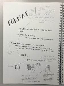
I have definitely learnt a tremendous amount from completing the project, from talking to print studios, setting up artworks correctly and trying to wrap my head around paper stock, through to binding, tip ins and making a hard back cover by hand. That’s without the amount I have developed my knowledge on typography and the handling of type. I really do believe that I will be able to take all these new and developed skills with me to future projects and into industry.

Despite all of the challenges faced, it was a very fulfilling experience and I am really proud of the outcome produced. If I were to do it again, I would definitely talk to print studios earlier to know what is achievable and realistic as that would help to inform my design as well as understand the binding process better to know the time it takes. I would also try to work on my time management skills better and set myself earlier deadlines to ensure the work is completed with plenty of time to spare in case something does go wrong, in this case if something had gone wrong, I would not have had the time to rectify the issue (which is a little scary).

ISTD: Further Development

Following on from feedback received, and reflecting on my intentions, I went about making further amendments to my design to improve it.

To do this successfully, I realised that I needed to work out exactly what it was I wanted to say and how I wanted people to feel during certain points within the publication. I therefore printed off my spreads, sat down with them and thought about the structure and narrative of the book, allowing me to make relevant decisions to improve the work. I felt this really helped give clarity for me to know exactly when the mood should change and how to best execute it.


This slideshow requires JavaScript.

One of the biggest problems I was having was with the typeface choice. It was made clear to me that Baskerville, Garamond and Mr Eaves were not working well together or separately. I therefore re-evaluated my typeface choices and tried multiple typefaces until I eventually paired Comorant Infant with Akkurat which worked really well not only together, but also separately.

Pairing multiple typefaces together to see which work best:-


Many of the serif typefaces seen above are too heavy and clunky on the page, making it feel very uneven and does not represent the subject matter very well. The sans serif typefaces also lack a genuine connection with the serif choices and don’t feel right on their own – with a project based heavily on emotions, the typefaces need to feel right together and for the subject at hand.

Final typeface choice:-

original_Page_04

There is a delicate nature to Comorant Infant that is light on the page and is a beautifully crafted typeface. Akkurat then interjects reflecting and commenting on what is taking place throughout. It is modern and contrasts with the serif choice in a balanced way that is reflective of me and what I want to say. Overall, I am very pleased with the final typeface choice because I think that not only do they work well together, but they work well for the tone of voice of the book itself.

IMG_9834

Having also discussed that I will be using the ‘Amazing Grace’ song within the publication, I decided to make it look like a song from a hymn book. I therefore researched multiple examples to gain a sense of the typeface and text placement as well as the additional information required to make it look realistic. The typefaces used are serif based and have a special quality to them, based on this I believe Caslon Pro would be a good choice to use as the letterforms themselves feel special.


Additionally, I started playing with the layouts at the end of the book. Originally the spreads went black when Gomer passed away and remained black thereafter, however, many people suggested that it should go from black to white as it reflects the final words of my mother better and is a symbol that he is at peace. I thought that it was a really nice sentiment and I therefore started playing around with how it could work. The final result can be seen below.


I personally believe that the full white spread is the strongest. It really brings home the message that is written and is the one that feels most peaceful. The colour used is soft and works well with the white, creating an almost calming feeling. I feel the grey is still too bleak and feels sad/ depressing, where as the black/ white spread feel awkward and really harsh – almost as though they are at war/ clashing with each other; which is not the desired result.

Following all the feedback received and working out what I wanted to say and how I want people to feel, I have made multiple changes to the design which can be seen below:


This slideshow requires JavaScript.

I am much happier with the progression of the design. I feel the colours of the tip-ins work really well as they compliment one another and I think the layouts themselves are much stronger than previously, due to the stronger use of hierarchy throughout which helps to give it more depth. The range of paper stock used throughout will help to push its tactile nature and reveal the different elements that come together throughout the book to eventually reveal the man behind the name. I think the four vivid memories are the ones that have progressed the most, each has been carefully considered and work with the image on the adjacent page. However, I don’t think the pink scribble and underline work – it was done with the pen tool as a trial. I will either have to do it by hand and scan it in, or strikethrough the words with a line.

I was also told that on the page where is says ‘Gomer’s wife passed away’, where the word ‘away’ cuts off at the edge of the page – it should go on to the following page along with an ellipsis to show it is not the end and there is more to come. I think this is a really smart suggestion and one I will definitely implement. Further to that, I was told that I should emphasise key words that are found on the tracing paper to heighten the use of hierarchy and really draw focus to key areas within the text.

Having improved the book dramatically, adding in tip-ins and amending the layouts, I printed off some test prints because I realised the size of the type was too big making it look clunky and awkward on the page. I therefore reduced the size of the text and printed them to see the difference and ensure it is correct.

IMG_9837

IMG_9838

I am much happier with this result and feel the type is working much stronger together. As can be seen above the size of the type is much more refined and does not feel like it is trying to shout at the reader.

IMG_9835

Above are the final colours of the tip-ins, printed, to give a real sense of how the colours will look with one another. Each colour has been chosen from the image of Gomer, in order to emphasise the connection between him and the book itself. It also emphasises that it is a journey of discovery with the aim trying to work out who he was.

Seeing the colours printed, I am very happy with the result. I think each colour compliments one another and they feel quite old – they resonate with that of an older person in my opinion, which is exactly what I want to convey.


Following discussions with my peers and lecturers, it was suggested that there should be an image or text on the reverse of the tip-ins because when you turn them over, you expect to see something that resonates with the text seen on the front. The lack of any visuals leaves a feeling of disappointment. With this in mind, I set about selecting images that would work for the text. It took a lot of trial and error to find the right images, but I do think it heightens the tip-ins and makes it stronger overall. Below are the final chosen images:


The images do have a colour overlay, being the colour of the tip-ins. They will also be much larger in scale revealing only a section of the image to create a sense of ambiguity. I am pleased with image selection and feel they work well with the text on the tip-ins emphasising what the words are saying.

As I have made the decision to hard back my book, I needed to decide what I was going to do for the end pages of the book. Through discussions, I thought that if I could find a wallpaper that was similar to the one in the photo of my great-grandfather it would further link the book to my great-grandfather and give something a little unexpected to the reader. I went to a local DIY shop and came across the wallpaper samples seen below.

IMG_9836

I was surprised to have found even one that seemed visually similar. I thought all four above had at least one quality that resonated with the image of the wallpaper but the top left sample stood out far more than the others in my opinion. The colour is the closest with the worn texture giving it the illusion of time having passed and age.


Below is the final design of the book before sending to print.


This slideshow requires JavaScript.

Overall, I am extremely pleased with the end result. I feel it does communicate the message I want it to say and is definitely a journey. I hope that the print will come out as strong. I have created mock ups and test prints to make sure that the sizing and spacing of everything is well considered and works well. I believe that all of the improvements made have benefited the overall design and has allowed it to progress considerably.

ISTD: Primary Research

As part of my research, I also went to my family to ask them of their memories of my great grandfather.

This slideshow requires JavaScript.

I wanted to get a sense of what it is they remember about him, to see if their memories would be vastly different or if there were overlaps. I realised there were definitely overlaps, but each also had a memory that was unique to them for various reasons.

I thought that there was something really nice and poetic in that and therefore I colour coordinated the memories into categories and separated them all out so that I had a clearer picture of not only him, but the memories that were said to me.

What this shows is that there is definite potential in using these memories to form the narrative of the story for the book, not only for the nature of the memories themselves, but also for the amount of content available to use. Also, having categorised them, it could help to form the structure of the book.

ISTD: Understanding Grids & Type

As part of my research I wanted to develop a better understanding of type and its anatomy as it is a typographic focused project and therefore I want to make sure I understand the reasons for selecting certain typefaces. It is also to be able to see the differences within other typefaces and understand the qualities that make them unique.

IMG_9151.jpg


I also looked into grid systems in order to try and gain a better understanding of how they work as I don’t really understand the different grids that can be used and their purposes. 

I have always been somewhat confused by them and I knew that using a solid grid system is essential for this project and therefore knew I needed to gain a better understanding of them.

What I managed to understand from them is that there are five main forms of gird structures; Manuscript, Column, Modular, Baseline and Hierarchical. Each have their main uses.

  • Manuscript grids are used in documents, PDFs, ebooks etc. that have lots of texts (think Microsoft Word).
  • Column grids tend to be used more in magazines to arrange the content into columns in order to make it easier to read.
  • Modular grids are almost like a checkerboard and can help to organise multiple elements on a page.
  • Baseline grids are defined by the line in which the text sits upon, it is the leading of the text that determines the size of the baseline. It is used to help create a good reading rhythm.
  • Hierarchical grids are mostly used for websites and digital displays.

Overall, I feel much more confident having taken some time to understand the two in more depth, I now feel more confidently to identify the anatomy of type and understand their different qualities. Also understanding grid systems has allowed me to make a more informed choice in regards to selecting what grid to use as I now know why and where they are used within different areas of design.

ISTD: Development

Following on from the final presentation, I was given feedback on how I could improve the document. I have therefore been working towards amending the outcome as much as possible. Due to the time frame, I have not been able to fulfil all the amendments as was hoped, but nonetheless I still feel I have made progress and have pushed the designs further.

This slideshow requires JavaScript.

For the first half of the book, I have tried to push the hierarchy further in order to create a stronger visual system. I have therefore increased the size on the headings as well as on the pull out quotes. I have also changed the Baskerville typeface to Caslon Pro as was suggested and I feel it is a much stronger choice, there is a clear difference between the Garamond typeface and the Caslon Pro typeface making it more distinct on the eye. It also has a neutral feel to it and so works for its purpose. In addition to that, I have broken the first half into parts and have included this on the spreads when a new question is being asked. This small detail sits within the same top right hand corner on each spread and therefore remains consistent.

From this is did wonder whether there is a need for my book to have page numbers and/ or a contents page? I am very unsure on this and it would be a discussion needed with my peers and tutors.

From the turning point in the book, I have began to make the relevant amendments. I have firstly changed the background of the pages from white to various tints of grey. Some darker than others to push the emotion that is being felt and reflecting on what the type itself reads. Although I think conceptually it works and makes complete sense, I think visually it looks a bit flat and doesn’t jump off the page. I will therefore try mark-making techniques and in order to create various textures to try and give the publication more personality and to again push the emotions it is trying to showcase. I do worry that the textures will take away from the type – as that is not the aim.

I have also worked on the ‘chaotic’ page and have been working to push that further. I have really played with scale and have scattered the words around the spread, preventing it from making coherent sense. The memories have become intertwined with one another. Although I think it is a massive improvement from the previous one, I still wonder if it can be pushed further and whether it is still too linear or if the use of scale is enough, and by adding more it will become overcrowded.


Intentions:

Having made a few amendments to the designs, I feel I have made a strong start and have begun to tackle the problems that were brought up to me during the final presentation.

From here, I intend to look into doing further changes. For the Amazing Grace song, I will look for a hymn book and look for the song in it to see how it is typeset, I can wither scan in the actual hymn book, or replicate it myself. This is to push where the song was sung and its relationship with my great grandfather. From this, I will then be able to manipulate the Amazing Grace song found at the end of the book.

As well as this, I will look into using tip ins. Having never come across them before or how they work, I realised it would take quite a bit of time getting my head round and therefore will spend more time looking into them.

The other pages that need attention are the four memories in the first half of the book. I am quite stuck on what to do with them and realised I need to really sit down with them and consider what it is I want to them to say to the reader. I also need to work on the page with the stairs and disappearing type, the broken letterforms and the pouring letters. These pages need more time as I want to really consider what it is the words are saying and how I want people to read them – how I want people to feel because I don’t want to do the same mistake s last time and simply illustrate them and create something cliché again.


Overall, I am pleased with what I have achieved and the amendments I have made. It is frustrating I wasn’t able to get more done, but I also don’t want to rush the work and create something that I know is not my best work.

ISTD: Final Presentation & Mock Up

Following on from all of my feedback I made a final mock up of the book and had a presentation, outlining all of my ideas and decisions for the publication.

Here is the mock up:

This slideshow requires JavaScript.


Here is the presentation:

This slideshow requires JavaScript.

Having completed my first mock up and presentation; presenting my mock up publication. I was able to receive useful feedback to help move it forward and allow me to improve the design.

The feedback I received from the my peers and the tutors included:

  • there was positive feedback on the juxtaposition between the full and empty pages as they create feelings of loss and confusion.
  • There was uncertainty of using Baskerville as it is very similar to Garamond – something I had picked up on prior to the presentation. This is particularly clear with the Amazing Grace song, it becomes lost in the page, when it shouldn’t. A suggestion given to me was Caslon Pro as it might to help make it feel more special. I was also told to play more with the visual language of the song; Amazing Grace in order to to push it further, what if there is a shape of the cross at the beginning?
  • I was advised to consider using tip-ins to elevate the sense of hierarchy and to ensure that there is enough differentiation between each person within the book.
  • The second half of the book starts to get a little cliché. The words are being illustrated rather than considering what they say and evoking an emotion from the reader. There should be a more consistent system running throughout.
  • The chaotic pages are not as chaotic as they could be, therefore they need to pushed further.
  • From the first black pages in the middle of the book, the following pages shouldn’t go back to white, try a grey tint – but consideration needs to be taken here when placing type on to tinted pages to ensure it remains legible to the reader.
  • The running heads on four of the pages looks odd because they only appear there and nowhere else in the document and therefore there needs to be a decision as to whether or not I will use them throughout or not at all.
  • The backwards song is too cliché and should be avoided.
  • The hierarchy needs to be pushed further – more play with scale is needed.

On personal reflection, I agree with everything that was said. I wanted to try a few different ideas to see whether they would work or not. However, what ended up happening was that I was focusing too much on how it looked rather than taking consideration into what the words were actually saying and trying to evoke an emotion. I am pleased with what I have designed, I think the choosing Garamond and Mr Eaves are a good decision as they work well together and there is a large variation within the Garamond font family – which is needed to separate the four strands. I feel I have created the foundation for the book and have a clear concept running throughout, it is now about building on top of that – which will mean taking a step back and looking at it with a fresh pair of eyes, paying particular attention to what is said and the emotion I want to convey to the reader.

ISTD: Initial Sketches and Designs

Below are my initial sketches and designs for the publication. I have tried to add multiple  ideas to the designs in order to fully explore my concept and showcase it to its potential.

These were quick sketches in order for me to get a sense of how many pages I would be looking at creating and how the structure of the document would work. I also wanted to get a sense of how the type could be played with within the document, looking at pace in particular in order to try and convey how the different emotions would be highlighted. The initial sketches showed that I was looking at creating around 80 pages / 40 spreads, which I initially didn’t expect.

The idea behind the structure of the book is to have some form of order and a pattern almost, asking questions to try and find out who he was – before the illness really took a turn for the worse. This is where the bulk of the text sits, with myself interjecting at various moments. There is then a turning point halfway in the book, whereby my great-grandfathers wife (so my great-grandmother) passes away. From this point the book deteriorates in order to highlight how my grew-grandfathers illness deteriorated. The order from the beginning is then lost and it is about really showcasing the different emotions felt when suffering with a disease such as Alzheimers.

I feel breaking the idea down really helped me to see how it could take shape because I feel the underlying concept is strong, but needs strong execution to allow it to sit at its fullest potential. Digitalising them will allow me to really see how the system works.

Choosing different typefaces…

From the offset I knew I wanted a traditional serif typeface for my family’s memories – but one with a large family in order to differentiate between the weights and to therefore differentiate between them. I also knew I wanted a more contemporary sans serif typeface for my voice because I feel a sans serif is much more current compared to a traditional sans serif, which would be appropriate for the time period my great-grandfather was alive. I am looking back into the past through the memories to find out who he was, therefore, the sans serif typeface is reflecting back at the serif typeface.

maris_latham__Page_03

My initial thought for the serif typeface was Baskerville for its beautifully crafted letterforms that feels as though it has a long history attached to it. I then quickly realised that it only has a limited number of weights – not enough for me within this publication. I then thought of Garamond for its visual similarity with Baskerville. Garamond has a very large font family and has been interpreted by type designers over the years, therefore there may be some minor differences to the original. I thought this was perfect for my concept because through research, I discovered that memories, when recalled are manipulated slightly before being restored – and as the serif typeface is meant to voice my family’s memories – I felt the two work harmoniously together. I also think Garamond feel rooted in history and has a classical feel to it.

For the sans serif – I really struggled with this. I read up on sans serif typefaces that compliment Garamond and what came up was Helvetica Neue, Futura and Gill Sans. I however, didn’t feel that any of these worked particularly well as they didn’t feel personal or felt like I was talking. It didn’t feel like me in a nutshell. I tried out multiple typefaces until I came to Mr Eaves. I was unsure at first, but when I really studied the letterforms, I felt as though they were light on the page and had personality to them. I thought they had a feminine essence to them and I felt like the type was me talking. I also thought it works well with Garamond and they compliment each other.

I then realised I needed a third typeface as a middle ground – a narrator almost for certain elements when it wasn’t anyone talking. I quickly put Baskerville in there for the time being but already concluded it was too similar to Garamond and simply didn’t work. This will need some thought but is not something I am overly worried about at the moment.

Digitalising the designs…

I brought my sketches to life by digitalising them and showcasing how the type could work using a variety of different systems to highlight different issues faced when dealing with the condition. I also wanted to get a feel for how some of the heavier text pages would work compositionally. Seeing it come to life allows me to see areas of strength and areas that need improvement.

My main aim for this document was to get all the text properly organised and set out in order to build the foundations of the book. Having the foundations set allows me to build on top of it and refine it until it is a strong final outcome. At the moment, I feel I have got a strong narrative and the main shell and structure of the book is there. As for the treatment of the type I need to do a lot more work in some areas and I don’t feel I am being experimental enough and am not pushing the type to its fullest extent. I also worry I am trying to do too many things at once. I do feel some guidance is needed at this point to help me push it forward as I worry I have been looking at it for too long and am getting stuck in not knowing which direction to go in.

ISTD: Tutorials (Part 2)

Following on from the interim critique, I still received tutorials from Theo and a final group tutorial with Ian, David and my peers.

Theo’s Tutorials:

Speaking to Theo following the presentation, I told him about the feedback I had received, particularly the one regarding the merging of all the solutions and include elements of them all within the narrative. He thought that was an interesting idea and had strong potential. I therefore showed him the visual research I had been looking at and told him of the song Amazing Grace that I found out my Great Grandfather loved. He really like the use of the song as it is such a recognisable song, meaning many people will be able to connect with it. He also thought that the visual research I was looking at was really interesting – with some interesting ways of displaying the type shown.

The final tutorial I had with him, I clarified my final solution and narrowed it down stating that I would add my own voice to the narrative because it became clear to me that just adding the memories made no sense and someone reading it with no idea what its about would be extremely confused. I also asked him to read the context I had written, introducing the book, and giving the reader an insight into what they are about to embark on, without explicitly talking about Alzheimer’s. He really liked what was written and liked the poetic nature of it. He did help to amend the structure slightly to allow it to flow better. We spoke of the use of imagery also, I suggested having one whole image of my great grandfather at the end of the book as a resolution – which he agreed would work well, but pointed out a break in pages is needed to allow the reader time to digest what has been read. He also suggested zooming into the image in places throughout, giving snippets to the reader without revealing the full image. I think this is definitely an idea worth exploring.

Overall, he seemed happy with my ideas and said that if it is well executed then it will be a solid outcome which was positive to hear.

Final Group Tutorial:

Following the interim critique, we had one final group tutorial. We were asked to bring as much work as possible. I was disappointed in myself for the amount of work I had done as it simply wasn’t enough. Nonetheless, I was struggling to know how to place the content in the book as I realised that just placing the text in will make no sense to the reader and they are unable to connect with the book. It was then suggested to me that I could use the Amazing Grace song as the spine of the book and have the memories coming from that. It was also suggested that I could include myself within the narrative making the focus of the book me trying to figure out who my great grandfather was. The reader is then invited to come along on the journey. I thought that was a great way to tackle my problem and was much stronger than the Amazing Grace idea, purely because I couldn’t see how it could work and therefore knew I would struggle with it.

Overall, although I was frustrated within myself that I hadn’t done as much work as I would have like to, I knew that unless I resolved my issue I wouldn’t have been able to take it forward. I therefore, found the tutorial to be extremely helpful.

ISTD: Visual Research

Following on from the presentation, I went on to complete visual research, looking at different typographic approaches that have been taken previously.

I began with general visual research to get a sense of different layouts, techniques and approaches that have been done and to gain inspiration for my own project.

The visual research I completed is a bit of a mix of images I have gathered, looking at a range of things. I did this to really try and get a feel for what has already been done, what is seen as cliché and what I think has been done really well. I wanted to get a much stronger sense of how people have played with type that relate to the issue I am looking at.

Let’s start with the images I think are cliché and should be avoided… images such as the disappearing type in the word ‘Alzheimer’s’ and the letters falling off the old man’s forehead are definitely things that should be avoided. I also think that the stitched ‘Alzheimer’s’ with the ‘me’ unravelling is something to be avoided. I do think it is rather interesting in how they’ve illustrated the word, but it does touch on the cliché side. I think the image of the mirror and the image with the book and acetate to fill in the words are really clever ways of approaching type in an experimental manner. I suggested using a mirror previously, but seeing it having been achieved showcases how it can work.

On the flip side to that, I think that the use of layering works really well because it creates depth and a sinking feeling. I also like the falling type, I think the way it has been handled above is rather delicate and creates a sense of hopelessness. I do quite like the images where ripping has been used, I think it can be used to show a sense of uncovering, like you’re trying to find something out that has been hidden – which could work well for my concept. But I do worry it touches on being cliché somewhat.

I have included images of hand rendered type to see how it could work if I wanted to include an element of childhood. I think it is an interesting approach to take and one that could work well, but I also don’t want to over do it with the typeface choices. The writing over the images is also an interesting approach. I think it has a reflective quality – like you are looking back in time at old photos.

Finally, I think that the use of image within the type is an interesting approach. The image with the silhouette of a person has been executed very well, the type is difficult to read in places, and you can vaguely make out a person within it – which would work exceptionally well for my concept. It is something to think about.

I also looked at designers who have excelled in editorial design, looking at the choices in layouts used and the experimentation involved.

Matt Willey:

It is evident just from this selection of images that Matt Wiley is an extremely talented editorial designer. I really admire his work because he is able to consider layout and hierarchy with amazing execution. He really understands the audience and selects all the elements accordingly. His work are good examples of the level to aim for within hierarchy and the level of typographic detail required. I think he uses negative space effectively, scale of the type is varied, creating higher levels of hierarchy, he considers the path of eye effectively and uses colour consciously to help with both hierarchy and path of eye for the reader.

Paula Scher:

I looked at Paula Scher because I like her experimental nature with typography and her playfulness with it. She also understand what the type is saying and really understands its purpose when creating her designs. She is colourful and current with her work and has the ability to adapt to different projects – which can clearly be seen from the two examples above.

David Carson:

The same can be said for David Carson as was said for Paula Scher. He is extremely experimental with his designs and creates layouts that go beyond the norm. He uses scale particularly well and considers his composition well. I like the bold nature of the designs that can be seen above and he again considers what the text is saying and its purpose to help allow him to experiment further – within the the right context.

Armin Hofmann:

Armin Hofmann typographic work is again experimental in nature, but not to the extent of David Carson as there is much more structure to his designs. They are clean and considered in nature and clearly uses a solid grid system throughout. He again uses scale to really push his designs and considers the path of eye well for the reader. The lack of colour is interesting, it creates depth to his work and a seriousness not seen to the same extent in the other examples.

Finally, I looked at other ISTD examples and have looked specifically at two entries that appear similar to my concept.

Example 1:

This ISTD project is titled; Alzheimer’s and explores the disease in a literal sense. It breaks down what the condition is, how it affects a person and uses personal stories to convey the devastation attached with the disease.

The whole book has been kept in black and white – apart from the one spread, which is in red. This lack of colour highlights the loss of personality as a result of the disease – this is something I want to avoid because people are colourful and emotions connect with colour.

The individual has used a range of typographic styles – using scale, transparency, layering and hand rendered type to convey the message.

I feel personally, that many of the elements feel a little obvious – mostly the disappearing type. I also think that the images used are the focal point above the type – and one spread has no type, only an image – something I aim to avoid as the type creates the imagery. There are also moments to be celebrated – particularly the ‘helpless’ spread as the type really conveys what the word says. The use of the post-it notes is a nice touch as it really resonates with the audience.

Overall, I think the outcome is an interesting take on the topic. However, I feel they’ve take a very literal approach – something I am trying to avoid. I want to create an experience that will be unique to the reader.

Example 2:

This ISTD outcome explores the journey of a memory. This takes a different view from the last example, but still relates to my concept (loosely). This ISTD, like the previous looks at its subject in a literal manner – looking at the process involved in gaining memories. The individual also takes a philosophical approach and looks at how memories define who we are.

The outcome itself has been beautifully handled. It is much more text heavy – but this has been handled confidently. The subtle use of blue helps to break the pages up more. They are very structured pages – highlighting a strong grid system has been used throughout.

It is a very considered piece of design – with exceptional type setting and detailing throughout – this is the level of detail required and one I intend to ensure I fulfil.

I do question whether hierarchy could be pushed further? However, this will undoubtedly differ within my design as the underlying concept is different.

I’m glad I’ve seen this example as it has shown the high level required for this competition – and the amount of work needed.

ISTD: Concepts

Following from my initial mind mapping looking at the theme lost in general and from Theo’s ideation workshop, I have selected three concepts that can be explored in further depth.

Concept 1. Alzheimer’s:

The first concept looks into the disease; Alzheimer’s – but not looking at it so straight forward as a disease that causes memory loss as I worry that is a very obvious approach. I worry looking into Alzheimer’s is a rather obvious route to take for loss, but I think if handled well, it does have potential. The thought behind this idea came from the story of my Great Grandfather, he passed away when I was very young, meaning I have no recollection of him. I know he suffered from Alzheimer’s and therefore wondered if I used my family’s memories of him to build the narrative.

Through more research I learnt a lot more surrounding the disease as well as learning about memories, I also looked at visuals of what comes up when looking at artwork relating to Alzheimer’s. This gave me a good insight into aesthetics relating to the topic.

With the idea of my Great Grandfather, I thought I could build the memories up so that they form and image of my great-grandfather almost – the reader builds him up using their imagination – idea that although he lost his memories, he lives on in the memories of others. Another approach could be that memories are built up to the halfway point and then are lost backwards – like how memories are lost backwards to childhood as a result of the disease. Also, through looking into memories, I learnt that each time we recall a memory, we manipulate it and change it slightly before putting it back into storage – therefore it calls to question that the memories my family have of my great-grandfather are exact. This could then almost be like a fairytale or storybook of some form?

Overall, I think that it is a strong concept – if handled well – has a lot of potential. It is important that if this concept is chosen, that I avoid doing anything cliché as that will remove the power the content could have.

Concept 2. Loss as a Positive:

The idea behind this concept was to look at the word ‘lost’ through a positive lens because I feel the word automatically has negative connotations. This idea was sparked after hearing about Freddie Mercury’s life and how he was forced to flee his home in Zanzibar to Britain due to the Zanzibar revolution, how his death helped bring the Aids movement and how even after his death, he is still considered a legend and is loved by many. There are different areas that this could be broken down into, from looking at what he lost through the conflict that occurred where he lived, through to what the loss of life lead to – the aids movement lead to so much research, meaning today people can live with the disease and is not stigmatised so much.

This lead me to think of other forms of losses that have lead to more being gained from them. This included; Wales v. Portugal semi-final in the football World Cup, whereby even though they lost, they came back heroes and united Wales together. There was also Martin Luther King Jr. and what his death lead to – the civil rights movement. Finally, I looked at it slightly differently, losing stress and what that feels like and looks like. Losing  something that affects your quality of life could be an interesting avenue. What does the manifestation of stress look like?

Overall, I think this is another strong idea that has many potential avenues that could be explored. I think I like the idea of following someone’s life as that is a good way to form a narrative and make it feel more personal – allowing people to connect with it.

Concept 3. Loss of Reality:

This concept was formed originally from the book; The Man Who Mistook His Wife for a Hat and Lord of the Flies. The first book is a collection of case studies from psychologist, Oliver Sacks looking into various mental illnesses and the extremities of how the mind can go wrong. An example of this is a man genuinely mistaking his wife for a hat and another looking at a man trying to throw his leg away, convinced it doesn’t belong to him. The second book is fictional, looking at a group of boys who become stranded on an island, over time control is lost and chaos erupts – it is a very well known book and the element of loss of control is what the focal point would be.

I have also looked into mental illnesses that cause the individual to lose touch with reality such as psychosis, schizophrenia, hallucinations etc. I think they could be visually interesting – but I feel that using one of the narratives discussed above is a stronger avenue to take. I also think this concept can relate to the first concept through looking at Alzheimer’s as a loss of reality, which for the individual it is.

Overall, I think this concept is an interesting one, I question if it is as strong as the other two concepts, and as mentioned I think this could link with the first concept quite well – is there something in this?

On the whole, I think all three concepts have legs and could be visually interesting, using interesting narratives to shape them. However, I believe that the Alzheimer’s concept is the strongest and has many avenues that can be explored. I do worry that it could end up looking very cliché and may be an obvious approach to take. But I also believe that if it is well considered then it can be an extremely interesting outcome that takes a different viewpoint to the topic. I will aim to ensure that I avoid the clichés as that will make or break this idea.

I will now explore the potential solutions that this idea can be carried through.


Potential Solutions:

Following on from developing my concept, I needed to think of different ways of tackling the overarching idea.

This was broken down into four potential solutions.

Solution 1:

This was to use memories of my Great-Grandfather to build a narrative of who he was, but to make the reader feel as though they were experiencing Alzheimer’s (to an extent) – mostly the emotions that are attached (frustrated, confused, lost, moments of clarity).  The reader therefore gets a sense of what it’s like have the disease, whilst trying to figure out who my Great-Grandfather was through reading my family’s memories about him. It comes back to the phrase: he became lost in himself through the loss of his memories, but lives on in the memories of others.

Solution 2:

This solution was to take a well-known piece of text or a song and deconstruct it so that it was written for a child and build it up until it is fully formed (reaching adulthood) and then deconstructing it again, showing the effects of Alzheimer’s and how it takes things away slowly, but also looks at the way memories go backwards as the condition worsens.

Solution 3:

Solution three was to take a sort of fairytale approach to the design because memories, when recalled are manipulated slightly and therefore it can be questioned whether the memories my family have of him are genuine or if they are interpretations of what actually happened. Therefore, the publication itself could reflect that of a storybook with the story creating a character for the reader.

Solution 4:

The final solution was to look at Alzheimer’s disease as a loss of reality. This can be a really experimental publication, what if the reader had to read the book backwards? What if the text was backwards and there was a mirror inside to allow the audience to read the text. It is about really pushing the emotions and experiences attached with the disease to really give the audience an understanding of what it is like without explicitly talking about the disease.

Overall, I think there are four strong solutions presented, but I am struggling to choose a direction to take it in and will therefore present them at the interim critique in order to gain feedback and know where to go next. Some of the ideas do clearly overlap and there are strong elements within each and some areas that can be questioned, which is why I am struggling to decide.