FMP: Concepts

Following on from initial research, I have been taking a lot of time to consider what I want to focus on specifically for my FMP. It has been very challenging trying to narrow in on what I am trying to say – as there are so many worthy things to explore. I also completely love the; ‘The Autocomplete Truth’ project for its striking, immediate and critical nature and want to create something that communicates to that standard.

I originally outlined in my creative brief that I wanted to work with type for its close resemblance to people and progressing forward, it is still an area I would like to focus on, as I think it would be interesting to see how I could answer the brief through this format.

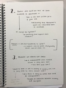
Below are images of ideas and thoughts I had:

IMG_9660

IMG_9663

I began looking at gathering key quotes from articles I’d read or interviews I’d listened to and one that caught my attention was the quote; ‘labels create us and them‘ – which made me think of potentially having a reel of labels for people to take – as stickers – with a large label on the wall within my exhibition space. The idea would be exploring the issues brought with labelling, yet contradicting that by having lots of people labelling themselves.

Through discussions, the idea of having a genderless typeface was discussed. How would that look? This lead me to think of designing my own genderless typeface – but also integrating that with a stereotypical female typeface, as well as a stereotypical male typeface. Looking at it straight ahead could reveal the genderless typeface – but moving to either the left or right would then reveal the male/ female typefaces. This could open up discussions about stereotyping and how it is everywhere – and how we all do it, but could potentially open up conversations about gender as a spectrum – following on from my criticality project. Looking into variable typefaces would work really well for this idea, what if the masculine/ feminine typefaces are an extension of the genderless typeface?

Working with the idea of type representing ideologies, I thought of potentially having messages or phrases that contradict the typeface used i.e. using a feminine script typeface to say something unexpected such as ‘I fight in the Army’ or using a masculine bold typeface to say ‘I’m a ballerina’. This idea again plays on the notion of stereotypes and how we view people.

Another idea included exploring all the stereotypes that both men and women face in this day and age and writing them over and over again very small, over a large surface area – to create an anamorphic sculpture – when stood in the right place, the negative space from the words would spell out a message i.e. ‘I am not a stereotype’ etc. This would highlight how stereotypes are all around us, everywhere, everyday – but by forcing someone to confront it, they are presented with a message that highlights the issues of stereotyping.

Other ideas which were discussed included, looking into potentially coding typefaces in such a way that when you click on bold (for example) you would actually get a light weight – revealing that what you see isn’t necessarily what you get – just like people. Another way to highlight this idea is looking into the pixels of a typeface – so altering the inside of the typeface – so when zoomed out and looking at it as a whole, it looks like a well constructed typeface, but when looking closely, you can see something different.

Overall, I feel I have explored multiple avenues of ways that I could highlight my chosen issue, although each is relating to type, it is looking at it from a different perspective. I will discuss these ideas with my peers and lecturers to gain further opinions and thoughts on how they could be developed and to make a decision on which is the strongest and the one I should focus in order for me to progress forward and begin the designing process.


From developing my concepts and reflecting on them, I began to question whether using type would be relevant enough and connect to people – one of the greatest strengths of ‘The Autocomplete Truth’ project was that it used a search box from a search engine – something people use everyday and are very accustomed too. This got me thinking about the type used to represent men and women and see how they differ; particularly with male/ female products…

women

men

mens-vs-womens-products.jpg

From completing this research, I quickly realised that the typefaces used for male based products in comparison to female based products differ vastly. I would be wrong in saying that every brand does this, as I did come across brands that were either for both men and women, or simply didn’t appear to assign a gender. As can be seen the typefaces for women are more scripted, light and delicate in general. Whereas, for men, the typefaces are bolder, sterner and weighted. There is a clear strong contrast and these are products that we shop for and see everyday within our local high street stores and supermarkets. These typefaces encapsulate the generic stereotypes faced by men and women and therefore carry embedded ideologies within our everyday lives.

However, it is even more apparent that the colours and design of the physical product itself emphasise the stereotypes embedded within them even further. There are distinctive features shared between all of the male products and features shared between all of the female products.

By doing this research, it became apparent to me that this is an issue that is current and people can connect with – it is something seen everyday, that we probably don’t even batter an eyelid towards. I feel this has opened more doors for me and I now feel more confident in going forward as this will definitely help direct my outcome.


In addition to the research conducted above, I realised I have spoken in great depth regarding stereotypes, but have not actually highlighted what these stereotypes are. From reading multiple articles and listening to interviews and podcasts, as well as being a women myself and having an awareness of my environment, I have gathered a list of stereotypes women face…

  • Nurturing
  • Caring
  • Motherly
  • Soft
  • Weak
  • Bad drivers
  • Caregivers
  • Maternal
  • Dumb blonde
  • Princess
  • Whore
  • Slut
  • Slag
  • Bitch
  • Temptress
  • Girl next door
  • Piece of meat
  • Yummy mummy
  • Housewife
  • Indecisive
  • Take a long time to get ready
  • Catty
  • Dramatic
  • Crazy
  • Delusional
  • Unhinged
  • Hysterical
  • Irrational
  • Emotional
  • Talkative
  • Home-Oriented
  • Passive
  • Sensitive

As can be seen above – there are a lot (and probably a lot more that I have missed) and these stereotypes have existed for such a long time, yet despite the change in equal rights for men and women, these stereotypes remain to exist and limit what women can achieve – particularly in regards to jobs and careers.

On the flip side of this, I think it is important to note that there are also stereotypes that men have to face – which can also be difficult for them to deal with (male suicide rates are a key example of this).

  • Masculine
  • Dominant
  • Powerful
  • Tall
  • Muscles
  • Handsome
  • Smart
  • Rational
  • Decisive
  • In control
  • Capable
  • Aggressive
  • Logical
  • Analytical
  • Cruel
  • Blunt
  • Tough
  • Shouldn’t be seen crying
  • Don’t show emotions
  • Funny
  • Charismatic
  • Charming
  • Assertive
  • Strong
  • Confident
  • Nerdy

The stereotypes assigned for men are clearly very different from what is seen within women. These stereotypes do not leave room for men to show ‘weakness’. Although both genders have stereotypes that are simply unrealistic and do not reflect individuals – it is these stereotypes that have shaped society into what we see and know today. Until these stereotypes are broken down and awareness is raised over the influence of stereotypes and the unconscious bias that they cause, women will always fight for equality.

ISTD: Concepts

Following from my initial mind mapping looking at the theme lost in general and from Theo’s ideation workshop, I have selected three concepts that can be explored in further depth.

Concept 1. Alzheimer’s:

The first concept looks into the disease; Alzheimer’s – but not looking at it so straight forward as a disease that causes memory loss as I worry that is a very obvious approach. I worry looking into Alzheimer’s is a rather obvious route to take for loss, but I think if handled well, it does have potential. The thought behind this idea came from the story of my Great Grandfather, he passed away when I was very young, meaning I have no recollection of him. I know he suffered from Alzheimer’s and therefore wondered if I used my family’s memories of him to build the narrative.

Through more research I learnt a lot more surrounding the disease as well as learning about memories, I also looked at visuals of what comes up when looking at artwork relating to Alzheimer’s. This gave me a good insight into aesthetics relating to the topic.

With the idea of my Great Grandfather, I thought I could build the memories up so that they form and image of my great-grandfather almost – the reader builds him up using their imagination – idea that although he lost his memories, he lives on in the memories of others. Another approach could be that memories are built up to the halfway point and then are lost backwards – like how memories are lost backwards to childhood as a result of the disease. Also, through looking into memories, I learnt that each time we recall a memory, we manipulate it and change it slightly before putting it back into storage – therefore it calls to question that the memories my family have of my great-grandfather are exact. This could then almost be like a fairytale or storybook of some form?

Overall, I think that it is a strong concept – if handled well – has a lot of potential. It is important that if this concept is chosen, that I avoid doing anything cliché as that will remove the power the content could have.

Concept 2. Loss as a Positive:

The idea behind this concept was to look at the word ‘lost’ through a positive lens because I feel the word automatically has negative connotations. This idea was sparked after hearing about Freddie Mercury’s life and how he was forced to flee his home in Zanzibar to Britain due to the Zanzibar revolution, how his death helped bring the Aids movement and how even after his death, he is still considered a legend and is loved by many. There are different areas that this could be broken down into, from looking at what he lost through the conflict that occurred where he lived, through to what the loss of life lead to – the aids movement lead to so much research, meaning today people can live with the disease and is not stigmatised so much.

This lead me to think of other forms of losses that have lead to more being gained from them. This included; Wales v. Portugal semi-final in the football World Cup, whereby even though they lost, they came back heroes and united Wales together. There was also Martin Luther King Jr. and what his death lead to – the civil rights movement. Finally, I looked at it slightly differently, losing stress and what that feels like and looks like. Losing  something that affects your quality of life could be an interesting avenue. What does the manifestation of stress look like?

Overall, I think this is another strong idea that has many potential avenues that could be explored. I think I like the idea of following someone’s life as that is a good way to form a narrative and make it feel more personal – allowing people to connect with it.

Concept 3. Loss of Reality:

This concept was formed originally from the book; The Man Who Mistook His Wife for a Hat and Lord of the Flies. The first book is a collection of case studies from psychologist, Oliver Sacks looking into various mental illnesses and the extremities of how the mind can go wrong. An example of this is a man genuinely mistaking his wife for a hat and another looking at a man trying to throw his leg away, convinced it doesn’t belong to him. The second book is fictional, looking at a group of boys who become stranded on an island, over time control is lost and chaos erupts – it is a very well known book and the element of loss of control is what the focal point would be.

I have also looked into mental illnesses that cause the individual to lose touch with reality such as psychosis, schizophrenia, hallucinations etc. I think they could be visually interesting – but I feel that using one of the narratives discussed above is a stronger avenue to take. I also think this concept can relate to the first concept through looking at Alzheimer’s as a loss of reality, which for the individual it is.

Overall, I think this concept is an interesting one, I question if it is as strong as the other two concepts, and as mentioned I think this could link with the first concept quite well – is there something in this?

On the whole, I think all three concepts have legs and could be visually interesting, using interesting narratives to shape them. However, I believe that the Alzheimer’s concept is the strongest and has many avenues that can be explored. I do worry that it could end up looking very cliché and may be an obvious approach to take. But I also believe that if it is well considered then it can be an extremely interesting outcome that takes a different viewpoint to the topic. I will aim to ensure that I avoid the clichés as that will make or break this idea.

I will now explore the potential solutions that this idea can be carried through.


Potential Solutions:

Following on from developing my concept, I needed to think of different ways of tackling the overarching idea.

This was broken down into four potential solutions.

Solution 1:

This was to use memories of my Great-Grandfather to build a narrative of who he was, but to make the reader feel as though they were experiencing Alzheimer’s (to an extent) – mostly the emotions that are attached (frustrated, confused, lost, moments of clarity).  The reader therefore gets a sense of what it’s like have the disease, whilst trying to figure out who my Great-Grandfather was through reading my family’s memories about him. It comes back to the phrase: he became lost in himself through the loss of his memories, but lives on in the memories of others.

Solution 2:

This solution was to take a well-known piece of text or a song and deconstruct it so that it was written for a child and build it up until it is fully formed (reaching adulthood) and then deconstructing it again, showing the effects of Alzheimer’s and how it takes things away slowly, but also looks at the way memories go backwards as the condition worsens.

Solution 3:

Solution three was to take a sort of fairytale approach to the design because memories, when recalled are manipulated slightly and therefore it can be questioned whether the memories my family have of him are genuine or if they are interpretations of what actually happened. Therefore, the publication itself could reflect that of a storybook with the story creating a character for the reader.

Solution 4:

The final solution was to look at Alzheimer’s disease as a loss of reality. This can be a really experimental publication, what if the reader had to read the book backwards? What if the text was backwards and there was a mirror inside to allow the audience to read the text. It is about really pushing the emotions and experiences attached with the disease to really give the audience an understanding of what it is like without explicitly talking about the disease.

Overall, I think there are four strong solutions presented, but I am struggling to choose a direction to take it in and will therefore present them at the interim critique in order to gain feedback and know where to go next. Some of the ideas do clearly overlap and there are strong elements within each and some areas that can be questioned, which is why I am struggling to decide.