Following on from feedback received, and reflecting on my intentions, I went about making further amendments to my design to improve it.
To do this successfully, I realised that I needed to work out exactly what it was I wanted to say and how I wanted people to feel during certain points within the publication. I therefore printed off my spreads, sat down with them and thought about the structure and narrative of the book, allowing me to make relevant decisions to improve the work. I felt this really helped give clarity for me to know exactly when the mood should change and how to best execute it.
One of the biggest problems I was having was with the typeface choice. It was made clear to me that Baskerville, Garamond and Mr Eaves were not working well together or separately. I therefore re-evaluated my typeface choices and tried multiple typefaces until I eventually paired Comorant Infant with Akkurat which worked really well not only together, but also separately.
Pairing multiple typefaces together to see which work best:-


Many of the serif typefaces seen above are too heavy and clunky on the page, making it feel very uneven and does not represent the subject matter very well. The sans serif typefaces also lack a genuine connection with the serif choices and don’t feel right on their own – with a project based heavily on emotions, the typefaces need to feel right together and for the subject at hand.
Final typeface choice:-

There is a delicate nature to Comorant Infant that is light on the page and is a beautifully crafted typeface. Akkurat then interjects reflecting and commenting on what is taking place throughout. It is modern and contrasts with the serif choice in a balanced way that is reflective of me and what I want to say. Overall, I am very pleased with the final typeface choice because I think that not only do they work well together, but they work well for the tone of voice of the book itself.

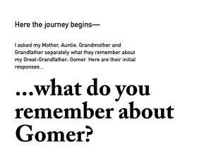
Having also discussed that I will be using the ‘Amazing Grace’ song within the publication, I decided to make it look like a song from a hymn book. I therefore researched multiple examples to gain a sense of the typeface and text placement as well as the additional information required to make it look realistic. The typefaces used are serif based and have a special quality to them, based on this I believe Caslon Pro would be a good choice to use as the letterforms themselves feel special.


Additionally, I started playing with the layouts at the end of the book. Originally the spreads went black when Gomer passed away and remained black thereafter, however, many people suggested that it should go from black to white as it reflects the final words of my mother better and is a symbol that he is at peace. I thought that it was a really nice sentiment and I therefore started playing around with how it could work. The final result can be seen below.


I personally believe that the full white spread is the strongest. It really brings home the message that is written and is the one that feels most peaceful. The colour used is soft and works well with the white, creating an almost calming feeling. I feel the grey is still too bleak and feels sad/ depressing, where as the black/ white spread feel awkward and really harsh – almost as though they are at war/ clashing with each other; which is not the desired result.
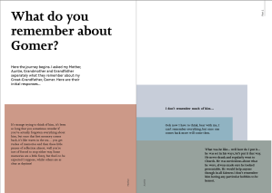
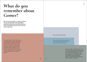
Following all the feedback received and working out what I wanted to say and how I want people to feel, I have made multiple changes to the design which can be seen below:
I am much happier with the progression of the design. I feel the colours of the tip-ins work really well as they compliment one another and I think the layouts themselves are much stronger than previously, due to the stronger use of hierarchy throughout which helps to give it more depth. The range of paper stock used throughout will help to push its tactile nature and reveal the different elements that come together throughout the book to eventually reveal the man behind the name. I think the four vivid memories are the ones that have progressed the most, each has been carefully considered and work with the image on the adjacent page. However, I don’t think the pink scribble and underline work – it was done with the pen tool as a trial. I will either have to do it by hand and scan it in, or strikethrough the words with a line.
I was also told that on the page where is says ‘Gomer’s wife passed away’, where the word ‘away’ cuts off at the edge of the page – it should go on to the following page along with an ellipsis to show it is not the end and there is more to come. I think this is a really smart suggestion and one I will definitely implement. Further to that, I was told that I should emphasise key words that are found on the tracing paper to heighten the use of hierarchy and really draw focus to key areas within the text.
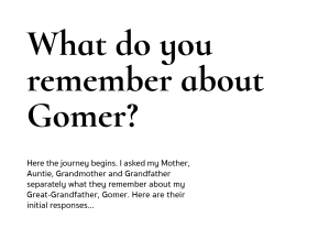
Having improved the book dramatically, adding in tip-ins and amending the layouts, I printed off some test prints because I realised the size of the type was too big making it look clunky and awkward on the page. I therefore reduced the size of the text and printed them to see the difference and ensure it is correct.


I am much happier with this result and feel the type is working much stronger together. As can be seen above the size of the type is much more refined and does not feel like it is trying to shout at the reader.

Above are the final colours of the tip-ins, printed, to give a real sense of how the colours will look with one another. Each colour has been chosen from the image of Gomer, in order to emphasise the connection between him and the book itself. It also emphasises that it is a journey of discovery with the aim trying to work out who he was.
Seeing the colours printed, I am very happy with the result. I think each colour compliments one another and they feel quite old – they resonate with that of an older person in my opinion, which is exactly what I want to convey.


Following discussions with my peers and lecturers, it was suggested that there should be an image or text on the reverse of the tip-ins because when you turn them over, you expect to see something that resonates with the text seen on the front. The lack of any visuals leaves a feeling of disappointment. With this in mind, I set about selecting images that would work for the text. It took a lot of trial and error to find the right images, but I do think it heightens the tip-ins and makes it stronger overall. Below are the final chosen images:


The images do have a colour overlay, being the colour of the tip-ins. They will also be much larger in scale revealing only a section of the image to create a sense of ambiguity. I am pleased with image selection and feel they work well with the text on the tip-ins emphasising what the words are saying.
As I have made the decision to hard back my book, I needed to decide what I was going to do for the end pages of the book. Through discussions, I thought that if I could find a wallpaper that was similar to the one in the photo of my great-grandfather it would further link the book to my great-grandfather and give something a little unexpected to the reader. I went to a local DIY shop and came across the wallpaper samples seen below.

I was surprised to have found even one that seemed visually similar. I thought all four above had at least one quality that resonated with the image of the wallpaper but the top left sample stood out far more than the others in my opinion. The colour is the closest with the worn texture giving it the illusion of time having passed and age.
Below is the final design of the book before sending to print.
Overall, I am extremely pleased with the end result. I feel it does communicate the message I want it to say and is definitely a journey. I hope that the print will come out as strong. I have created mock ups and test prints to make sure that the sizing and spacing of everything is well considered and works well. I believe that all of the improvements made have benefited the overall design and has allowed it to progress considerably.
